Discover how responsive web design enhances user experience, boosts SEO, reduces bounce rates, and increases conversions.
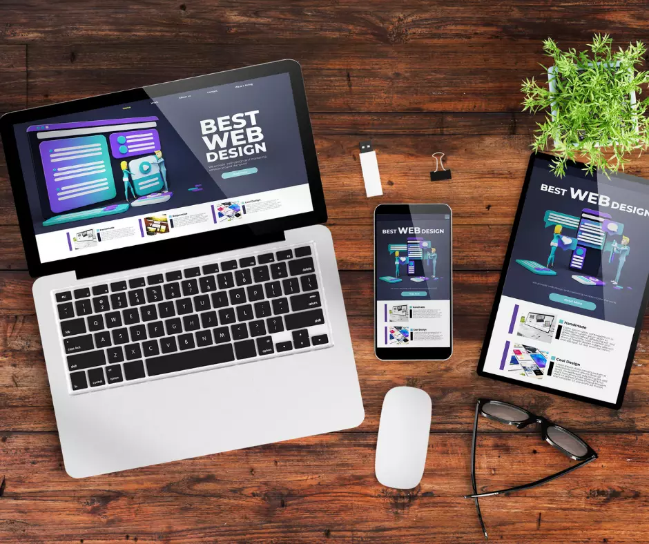
Staying responsive is not just a buzzword; it’s a necessity. The days of static websites that only look good on a desktop screen are long gone. Today, users are browsing on a multitude of devices, from smartphones to tablets to laptops, and your website needs to be ready to adapt to all of them.
So, what are the tangible benefits of having a responsive web design? Let’s look into some specifics.
Improved User Experience
Think about the frustration of trying to navigate a non-responsive website on a tiny smartphone screen. Pinching, zooming, and scrolling endlessly just to find basic information can drive users away faster than you can say "bounce rate." A responsive design ensures your site looks and works seamlessly across all devices, providing a smooth and enjoyable user experience.
Boosted SEO Performance
Search engines favour responsive websites, and Google specifically recommends responsive design as the best practice. With mobile-first indexing now the norm, responsive web design enhances your SEO efforts by ensuring your website is easier for search engines to crawl and index. This can significantly improve your visibility in search results, giving you a competitive edge in the digital space.
Faster Page Loading
Nobody likes waiting for a website to load, especially on a mobile device with a spotty connection. Responsive web design often leads to faster page loading times, thanks to techniques like optimising images and serving the right-sized content for each device. This not only improves user experience but also contributes to lower bounce rates and higher engagement.
Cost and Time Efficiency
In the past, businesses would create separate desktop and mobile versions of their websites. Not only was this a logistical headache, but it also required extra time and resources to maintain two separate sites. With a responsive design, you have one website that adapts to all screen sizes, reducing development and maintenance costs in the long run.
Increased Conversions
At the end of the day, the likely goal of your website is to convert visitors into customers. A responsive design can have a direct impact on your conversion rates. When users can easily navigate your site, find what they need, and make purchases or inquiries on any device, you’re more likely to see those conversion numbers climb.So, what’s the bottom line? Responsive web design isn’t just a trend; it’s a smart business move. By investing in a responsive design, you’re not only future-proofing your website but also improving user experience, boosting SEO, saving time and money, and ultimately increasing conversions.
Ready to make the switch to a responsive design?
Contact us today to learn how we can help your website reach its full potential across all devices.
Share this post
Subscribe to get exclusive content
Connect with Us
Are you ready to partner with a team committed to turning your business challenges into opportunities? Let’s build something extraordinary together!